It seems I have become the master of the day trip to Vegas: an early morning direct Southwest flight from Love Field into McCarran and an early evening return. In and out in the same day.
What, no fun in Vegas?
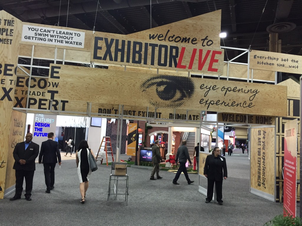
Let’s face it, Vegas is convention-trade show-event central. I headed out to the annual Exhibitor’s Show at Mandalay Bay with a plan: walk the exhibit floor at the event and visit with friends and new acquaintances.
The 2016 show was interesting and informative. Please don’t read that as “bland and mundane.” Quite the contrary, what I did see and hear was that the exhibits that were thematic and engaging won over the clientele. And, more than once, I heard the magic words after being asked “how is the show going for you?” replied with “great, qualified leads.” Not bad for people who coach others how to use exhibitry to their advantage, no?
Of particular note were three exhibits: MG Design, Exhibit Concepts and Derse, with an honorable mention to Hamilton Exhibits.
 MG took a college theme and played it for each day: Day 1 was dorm move in day; Day 2 was Homecoming; Day 3 was graduation. Staff uniforms matched the days and the booth took on the look of a college campus. Engagement was fun and even included a coffee bar. Traffic was heavy on Day 2 when I was there.
 Exhibit Concepts did a holistic approach of “Lighten Up.” Not only did they mean it literally (reduce the weight of your exhibit) but share the tactical responsibility of your show program with them. After a short sit-down with Director of Sales Jeff Kosolawski, even their one-on-ones with prospects resonated with that theme. Pre-, at- and post-show communication (mailings, e-mailings and social media) also replayed and reinforced the theme.
 Derse had an exhibit that other exhibitors were talking about. An open space with a wine/food bar and staff outfitted in matching vests and shirts. Lots of talk and qualifying under the fresh structural design.
Over at Hamilton, the engagement with food theme continued. Director of Strategy Lynne XXX, told me that they were thinking “outside the box” by creating customized trail mix in an exhibit space using unusual materials (from flooring to walls to canopy) to emphasize their versatility as exhibit makers. The space was inviting and the food hook helped them engage and qualify more and better leads, according to Lynne.
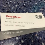 While I was there to engage as well (and I did trade dozens of business cards), I did take note of a few cool things. Of special note is this business card by Nancy Johnson of MG Design. Nice when you can give yourself a title. Nice ice breaker, Nancy!
Another memorable Exhibitor’s show showcasing new ideas and allowing the teachers to practice what they preach.
Relentless

