From the phone app that changes how you find information on the show floor to the ideas exhibited, the theme of this year’s National Retail Federation (NRF) Big Show of “Retail’s New Rules” was more true that any previous theme.
Technology, if it hadn’t taken over the selling floor already, certainly has now. From the seamless connected store demos of integrated software and hardware to loyalty programs to payment systems, retailing’s strategies are as much about technical connectedness as it is about pricing, displays and positioning. It is all about shopper engagement.
 As for the exhibition itself, the show floor at Jacob Javits Convention Center showed off a full range of exhibit styles as well as new and expected offerings. Overall, most exhibitors have chosen smaller spaces but chosen to fill them to the brim with their offerings. Fewer magicians and dancers, more product and practical interaction. Fabric and light-weight materials reigned, along with a focus on offering or product over the display itself.
Motorola had one of the more engaging exhibits. Putting their offerings in context allowed the visitor the chance to see themselves in the space as well as with the product. Large graphics and fixtures that fit a specific scene along with associated products helped paint a clear picture of the intent of the product.
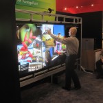
 The Hewlett Packard booth is a very traditional set of properties showing off a broad set of hardware and software solutions that are actually cutting edge. Since HP is one of the largest buyers of Intel chips, it only makes sense that they show hardware. But their seamless integration of software and peripherals from several partners helped set them apart. Their interactive video wall from their California “skunk works” really garnered attention.
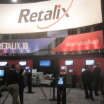
 Retalix, showed off their latest version of their R10 product. Every imaginable application on whatever hardware you might be using, made this platform-independent provider look the leader in its segment. A large solid header gave a solid feel to this product-stuffed exhibit.
Others of note:
- Pan Av, playing off their name’s similarity to the defunct airline, Pan American, built an exhibit around an airliner’s fuselage, complete with staff dressed as flight attendants and crew.
- Intel’s use of interactive walls and games to show off the power of their chips as well as engaging the visitors with hands-on cooking demos.
- Google’s branded boxy exhibit, glaring simple for such a technology-driven company.
- Airwatch’s overgrown (18-foot?) iPad.
- Ingenico’s “Close Encounters” imspired header sign.
- Wincor-Nixdorf’s product-centric display. Less display structure, more product and interaction.
- SAS’ wavy pink headers.
- Epson’s effective use of a partner pavilion and their trademark large graphics.
- Hughes’ repurposed (from another industry) “Store of the Future” exhibit and their sponsorship of the phone app put them front-and-center in the show spotlight.
This show continues to grow and flourish as technology continues to change the retail customer experience. No longer a show of retail fixtures and brick and mortar accessories, it is as technology and relationship driven as the environment it sells into.
TTSG
